The following email newsletters were answers to a speculative design request by Poketo, an LA-based artist and designer-made goods store.
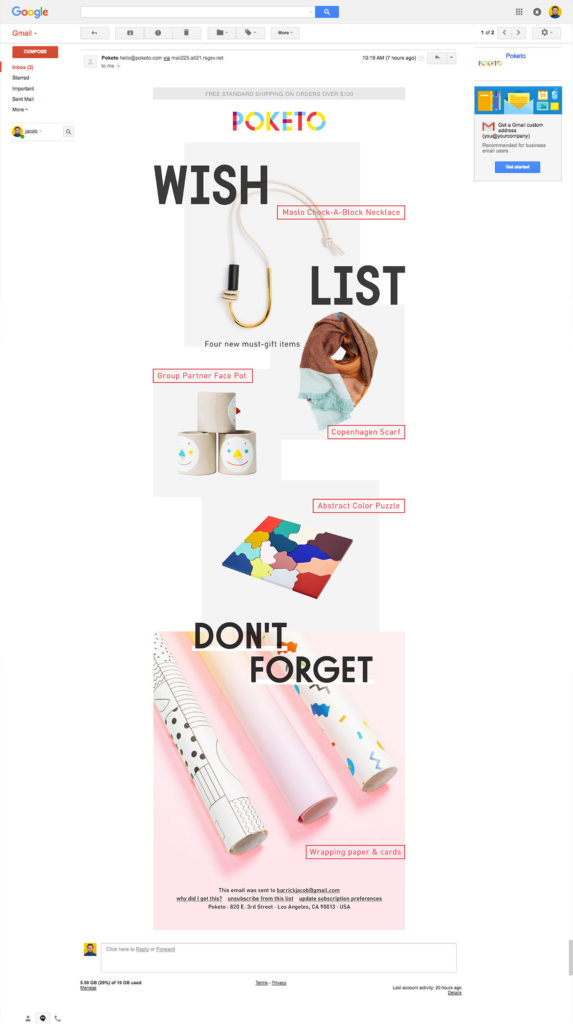
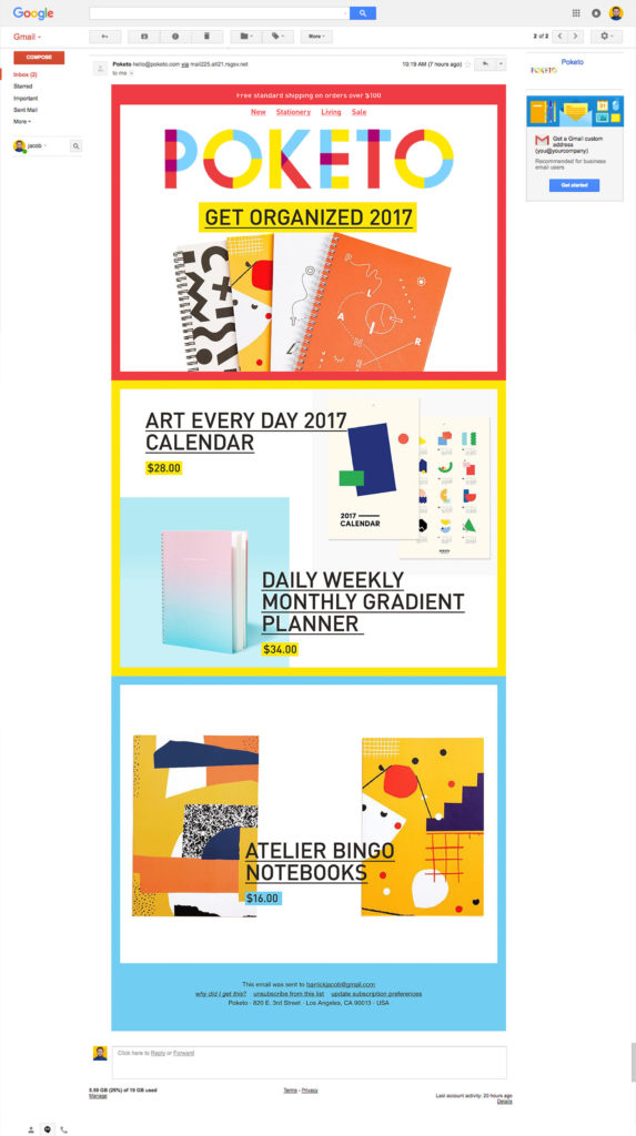
The first newsletter follows the existing Poketo brand more closely- light and airy, colorful, but not overwhelming. The combined edges of the photographs create an irregular border, peppered by scattered type. The second newsletter is more of a departure, using high-saturation colors and a trendy, full-width, colorblock approach. This newsletter focuses on color and balance to guide the eye.
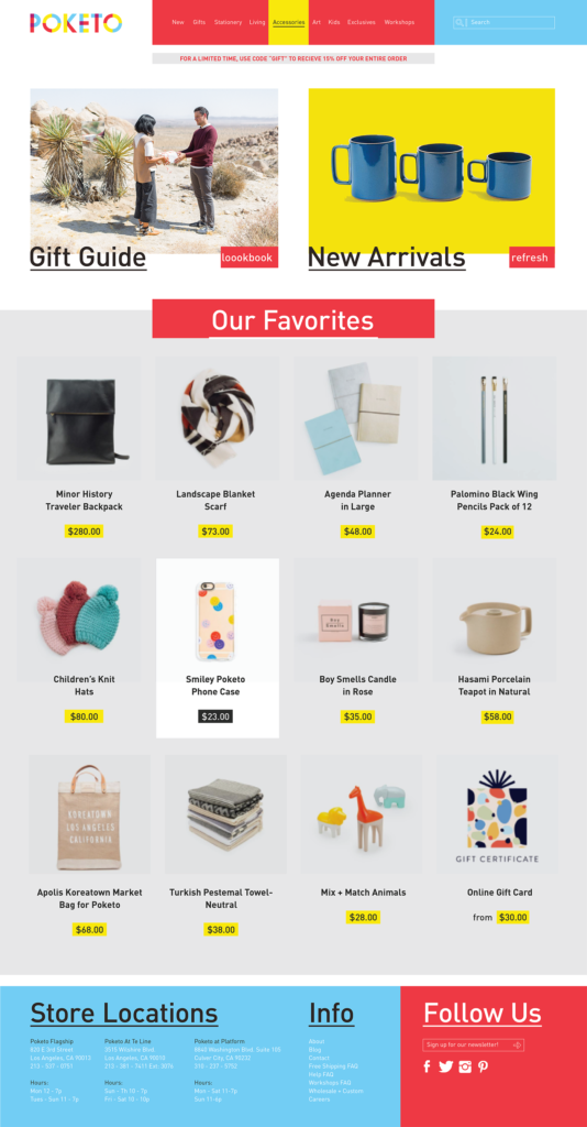
I was also asked to redesign the website. Their customers are often looking for the best gift to give, which is why I chose a seasonal gift guide to be shown as the left hero banner. The grid-based lower catalogue focuses on exploration and discovery as a mode of shopping.
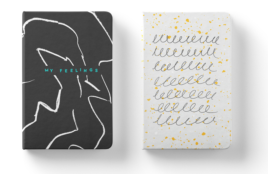
Finally, I was asked to design 2 notebook products. Both appeal to high design while speaking to a whimsy that aligns with Poketo’s core.


